


It all started when Lorin, the president of our company decided to take a vacation in Costa Rica. Great reviews and, crucially, a warm recommendation from a friend, landed him at Tikivillas rainforest lodge and some smug posts on the Facebook about how cool it was there. Idle talk lead naturally to talk about Lorin’s company and the owners were curious enough to ask what would he recommend for their website. This then lead to business: the sort of relaxed win-win business everyones wants to come their way.
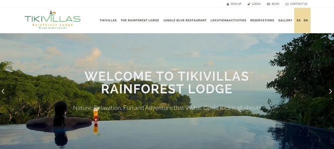
Based on Lorin’s descriptions and the photos we saw Tikivillas is one of those websites that simply cannot convey how stunningly beautiful the lodge and the surroundings are. As you can see from the above capture of the new website’s homepage ke Solutions opted for simplicity and a dynamic feel for the website. The whole website now has a flat design with elements of parallax to emphasize the imagery and a feeling of space.
One of the first things we had to do was to switch from Flash to images displayed in CSS - getting pages to load significantly faster (by at least 150%) and allowing search engines to index images and the text displayed in the slideshow.
Below you can see a comparison between the old version (left) and the new version (right) of the page detailing information about the location of the rainforest lodge and the many activities you can choose from while staying at the lodge. This pages exemplifies quite well what we did for the website as whole.
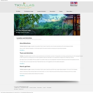
We got rid of the grey background and brought more color to the page. Next, our webdesign team streamlined the header to get it to feel more in line with the current webdesign trends. Also notice that we got a much better use of the page real estate by introducing the right-hand sidebar with emphasized and highly visible calls to action.
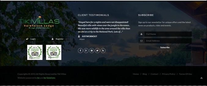
You can see that the old version did not have more than a modicum footer. Above you can see that we have significantly increased the area dedicated to the footer: the user can see testimonials, connect to social media channels (sorely lacking in the older version) and introduced an easy way to subscribe to newsletters.
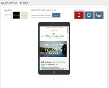
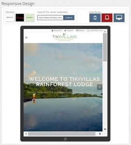
Any self-respecting website these days has to be responsive, i.e. adapting itself to the device it is being displayed on. In less than three weeks from the moment ke Solutions had all the data we needed (the content and the requirements), the owners were very happy to launch a modern, responsive website. Below you can see some screen captures from our own freely available responsive design checking tool that show how the website looks on a phone or a generic tablet.
So, this is how a vacation in a beautiful spot turned into a win-win for all involved. We certainly wish Tikivillas the success they richly deserve and hope this website to influence a lot of people to visit!
Posting comment as guest.
If you already have an account, please LOGIN.
If not, you may consider creating on. It’s FREE!