


Most of our work at ke Solutions is geared toward small to medium companies. For some (difficult to fathom) reason a lot of talk and advice about website building, web design, SEO and content management schemas focuses on issues that are far beyond either the budgetary constraints or even the interests of the vast majority of website owners. What do I do if I want to re-build my website without devoting a lot of time and resources to it, while still projecting a recognizable identity to my website?
Minimalist design
Owning a good website is actually not an expensive dream a small start-up. Some of the reasons for that that is the currently reigning webdesign philosophy - minimalism. This minimalism reversed a previous trend toward complex and ultra-realistic websites that were expecting VR (virtual reality) to appear overnight. It didn’t. What did appear though was smartphones and tablets and their owners insisted that they wanted to browse the net on their relatively small displays. Coming back to 2015 we are still in this general trend of minimalism and tasteful simplicity. Which is good news for a small business because it is relatively simple to implement, update and the costs are eminently reasonable. So, what to expect in 2015 in terms of webdesign?
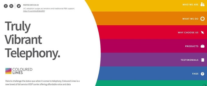
1. Flat design continues to be the winner
Awwwards - the premier jury panel on website creativity, usability, design and content - has a section dedicated entirely to flat design. A fact that speaks volumes about the current consensus on webdesign. This trends does not show any signs of abating nor should it based on data about internet browsing on devices other than computers / laptops. Smaller displays, bandwidth that is still quite limited and the very context in which browsing takes place (on-the-go) still converge towards flat design. See below a great example of a flat design from colouredlines.com.au.
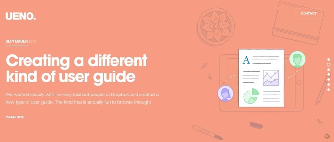
2. Long-scroll pages
Almost certainly the reason for long-scroll homepages can be traced to smartphone browsing. Nowadays, though, long-scroll evolved and can be found in other places other than the home page, such as about pages, product pages, etc. There are sites built entirely on the basis of a series of long scrolls. Below is an example of a long scroll - but you will have to visit ueno.co to see in action.
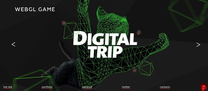
3. Variations on Parallax
By making the background webpage move slower than the foreground designers can create a feeling of depth. Parallax can be bold or subtle but the effect it creates allows for many creative approaches to webdesign. Virtually everyone cautions about overdoing it, but parallax is on the rise. Below is an example from HotDot Digital productions website.
4. Responsive design moving toward card-based design
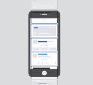
Responsive design you probably know, even if you never heard the term - it refers to the webpage ability to re-organize itself such that it can be displayed on various displays. Professionals will tell you - without exception - that if you own a site that is not responsive you have to “graduate” towards a responsive design or lose the mobile segment (50% on average).
More recently however, responsive design shows signs of becoming more than just a way to surpass display limitations. We are talking about a switch in the way we think of an interface. For instance, Paul Adams mused on his blog that mobile app notifications are gradually assuming a much more important role and morph into content cards, allowing easier user access to browse more information and even to take more actions straight from a pop-up. This trend transfers to websites as well but it remains to be seen whether it will become widespread or not.
5. Image-centered design and Cinemagraphs
Big, catchy images became a reliable center of gravity for many websites recently. While some decided to go without any image on the homepage (truly minimalist!), by far the majority opts for a single background image with little text to go with it. To which you will have to add - if we are allowed a bold prediction for 2015 - cinemagraphs.
Never heard of Cinemagraphs? Well, you should; when Facebook announces it loves something and wants to promote it, you most definitely should. From what I could gather the It started about 5 years ago with a photographer (named Jamie Beck) and a web designer (Kevin Burg) and their idea of creating animated gifs that have as their principal characteristic reduced motion or motion ascribed only to one or a few elements inside the picture frame (see a great example below). You can find more cinemagraphs at Ann Street Studio.

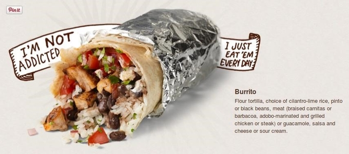
6. Hand-drawn websites
Still a minority, hand-drawn websites are catching a lot of attention. A bit more expensive than your average flat design plus long scroll with parallax, they offer your website personality if done by a competent designer. I had a lot of fun browsing for a good examples and I am sure they, on looks alone, can be significantly more memorable for a visitor than most of its competitors. For a great example see how Chipotle combined hand-drawn elements and text into the fabric of a great website (see below an example).
Now, I am sure a simple search will produce many other pages with webdesign trends for 2015. This is our list, based on not only what is possible but also on what is feasible within a limited budget. Do you think we’ve missed something that is worthwhile mentioning? Leave a note or email us and we will update the post!
Posting comment as guest.
If you already have an account, please LOGIN.
If not, you may consider creating on. It’s FREE!