


When Guy Kennet got frustrated with the currently available solutions to create your own customized phone app he wanted to do something different. Why couldn’t app creation be as simple as assembling a lego construct? Suppose you make a website where you create the modules for apps and put them online; then, you let the customer buy whatever is needed, choose the level of support needed and finally press “enter” to get his or her app.
Having worked with us before on a number of projects, Guy chose ke solutions, so here we are telling you about appzbizz - a presentation website linked to an online store designed from the outset to provide a set of tools for the mobile device. In terms of web design we were asked to create a design that combines simplicity with dynamic elements. Intended to promote app-building and customizing it goes without saying that this website was supposed to be responsive.
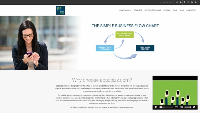
Homepage - the promiment “Why”
A presentation websites is all about product or a service. “Why choose appzbizz” is the most prominent feature of the homepage. A flowchart, a paragraph of text and a youtube video provide concurrent answers to this question.
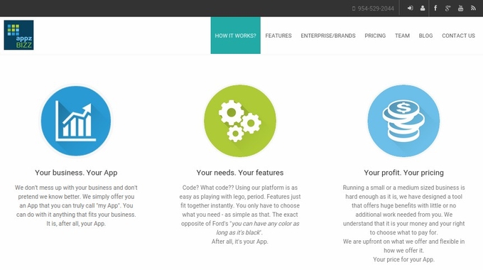
The homepage si an example of a relatively simple long-scroll page that is still in the top trends for 2015. Scrolling a bit down a visitor encounters a short vision statement from appzbizz in the form of three simple ideas: your business. your app, your needs. your features and your profit. your pricing (see capture below). The color palette is intended to show lightness and some of the elements are dynamic: hovering above one of the icons, for instance, will enlarge it.
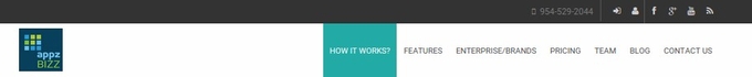
Simple navigation was never far from our goals. We gradually reduced the number of initially proposed pages and arrived at the seven pages you can see currently in the header capture (see above): How it works?, Features, Enterprise/Brands, Pricing, Team, Blog and Contact Us.
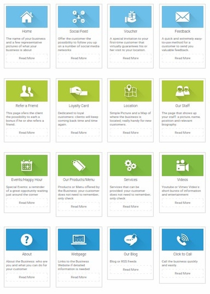
Without a doubt the site needed a clear way of showing what features an app can acquire. We in favor of showing a grid of icons we have carefully selected to be representative of each feature with a short text description attached to it (see capture below).
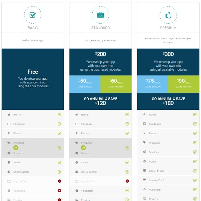
Competitive and flexible pricing is a point AppzBizz is particularly proud of and we wanted to emphasize that. We also wanted to expound “at a glance” the pricing options and their relative advantages. Below you can see a capture from the pricing page that shows how we implemented this visually.
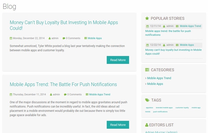
AppzBizz intends to be a very present in the social media and on its own blog. Consequently, we have created a page where a visitor can quickly check either recent posts or popular posts or chase some specific tags or editors (see the capture below).
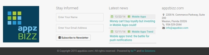
Finally, the footer is an example of “everything-at-a-glance”: from logo to subscription, from a summary of the latest news to the company’s contact details (see a capture of the footer below).
Do you like what we did with this presentation website? Let us know; we love feedback!
Do you have a presentation website that needs to be designed? If you like what you’ve seen so far, don’t hesitate to call us!
Posting comment as guest.
If you already have an account, please LOGIN.
If not, you may consider creating on. It’s FREE!